Plot the estimated curve \(Q(B), B \in (0, B_{max}]\). If the underlying estimated policy \(\pi_B\) entails treating zero units (that is, all the estimated treatment effects are negative) then this function returns an empty value.
# S3 method for maq
plot(
  x,
  ...,
  add = FALSE,
  horizontal.line = TRUE,
  ci.args = list(),
  grid.step = NULL
)
Arguments
| x | A maq object. |
|---|---|
| ... | Additional arguments passed to plot. |
| add | Whether to add to an already existing plot. Default is FALSE. |
| horizontal.line | Whether to draw a horizontal line where the Qini curve plateaus.
Only applies if the maq object is fit with a maximum |
| ci.args | A list of optional arguments to |
| grid.step | The spend grid increment size to plot the curve on. Default is
|
Value
A data.frame with the data making up the plot (point estimates and lower/upper 95% CIs)
Examples
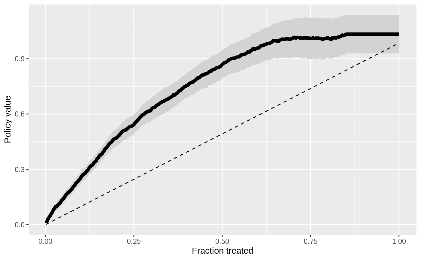
# \donttest{ # Generate toy data and customize plots. n <- 500 K <- 1 reward <- matrix(1 + rnorm(n * K), n, K) scores <- reward + matrix(rnorm(n * K), n, K) cost <- 1 # Fit Qini curves. qini <- maq(reward, cost, scores, R = 200) qini.avg <- maq(reward, cost, scores, R = 200, target.with.covariates = FALSE) # The plot method invisibly returns the plot data as a data.frame, # which allows for custom plotting with external libraries. df.qini.baseline <- plot(qini.avg)# Make an alternate plot style, using, for example, ggplot. if (require("ggplot2", quietly = TRUE)) { ggplot(df.qini, aes(x = spend, y = gain)) + geom_ribbon(aes(ymin = gain - 1.96 * std.err, ymax = gain + 1.96 * std.err), fill = "lightgray") + geom_line(linewidth = 2) + ylab("Policy value") + xlab("Fraction treated") + geom_line(data = df.qini.baseline, aes(x = spend, y = gain), lty = 2) }# `scale_maq()` rescales policy gain curves for specific application units. # Plot policy values for a maximum allocation of, for example, 500 units. plot(scale_maq(qini, 500), xlab = "Units treated")# }