This vignette gives a brief overview of how Qini curves (or cost curves) can act as an attractive and intuitive metric for evaluating treatment rules when there are costs associated with deploying treatment, as well as how they can be generalized to many treatment arms, as implemented in the companion package maq. For complete details, we refer to this paper.
Using estimated CATEs to derive treatment allocation policies
Before jumping into Qini curves, let’s start by defining some terminology and refreshing some concepts. Consider a binary treatment assignment \(W_i = \{0, 1\}\) and some outcome of interest \(Y_i\). In order to determine if there are certain subgroups of the population, as defined by some observable characteristics \(X_i\), that benefit differently from the treatment assignment, a central object of interest is the conditional average treatment effect (CATE)
\[\tau(X_i) = E[Y_i(1) - Y_i(0) \,|\, X_i = x],\]
where \(Y_i(1)\) and \(Y_i(0)\) are potential outcomes corresponding to the two treatment states: treatment or control arm.
There are many approaches to obtain estimates of the function \(\tau(X_i)\), Causal Forest being one of them. Now, once we an estimated \(\hat \tau(\cdot)\) function, obtained on some training set, what metric, on a held-out test set can we use to evaluate them with? That depends on our intended use case. In many cases, we are interested in using \(\hat \tau(\cdot)\) to inform treatment allocation. The estimated CATE function \(\hat \tau(\cdot)\) implicitly gives us a family of policies, which we refer to as \(\pi(\cdot)\), that takes covariates \(X_i\) and maps them to a treatment decision \(\{0: \text{don't treat}, 1: \text{treat}\}\). For example, we may have limited resources available, and decide we want to treat a maximum of 10% of units. The policy to treat the 10% of units with the highest predicted benefit is
\[ \pi(X_i) = \begin{cases} 1,& \text{if CATE predictions } \hat \tau(X_i) \geq \text{top 10%}\\ 0, & \text{otherwise}. \end{cases} \] The value of this policy is \(E[\pi(X_i) (Y_i(1) - Y_i(0))]\), and the associated policy can be expressed as a simple priority rule: treat units with predicted treatment effects above a certain threshold. This policy value satisfies a central limit theorem, i.e., even though the underlying function \(\hat \tau(\cdot)\) used to decide treatment allocation may be derived from complicated “black-box” machine learning algorithms, we can still get estimates and confidence intervals for how this policy is going to perform when deployed in the real world.
Qini curves: Evaluating policies over many decision thresholds
Consider now, for the sake of generality, the case where assigning treatment incurs a cost, where we let \(C_i(1)\) denote the cost of assigning unit \(i\) the treatment arm (and assume that withholding treatment is costless, \(C_i(0)=0\)). An example where costs may vary by unit could be in administering vaccines: getting medicines to people who live very far away from healthcare centers is likely more costly than getting medicines to people who live close by. Costs do not have to be monetary, they could also capture something more abstract, such as negative externalities.
The question we now ask is, given a budget \(B\), what is a suitable approach to quantify the cost-benefit tradeoff of assigning treatment in accordance with our estimated CATEs? It turns out that incorporating costs into the policy evaluation framework we outlined in the previous section is straightforward.
Recall the policy \(\pi(X_i)\) is a function that maps covariates \(X_i\) to a treatment decision, \(\pi(X_i) \in \{0: \text{don't treat}, 1: \text{treat}\}\). In this section, this function will depend on the budget \(B\) which we denote by the subscript \(\pi_B(X_i)\). It turns out that this policy can be expressed, just as in the previous section, as a treatment prioritization rule that essentially says “If you have \(B\) available to spend, then treat Alice if her estimated cost-benefit ratio, CATE/cost is above a certain cutoff”, and similarly for Bob, and so on. If Alice’s estimated CATE is negative, we would not consider treating her, as we would incur a cost, but reduce our gain.
We have available a test set with \(n\) observed outcomes and treatment assignments to perform evaluation on. We are interested in quantifying the expected gain (measured by the ATE) we can achieve by assigning treatment in accordance with \(\pi_B\) at different spend levels \(B\).
In the previous section, we left out the exact details of how to evaluate a policy. Luckily, it turns out this is simple: if we know the treatment randomization probabilities, then we can use inverse-propensity weighting (IPW) to estimate the value of the gain we achieve through averaging the difference in test set outcomes that matches our policy prescription:
\[ \frac{1}{n} \sum_{i}^{n} \pi_B(X_i) \left( \frac{W_i Y_i}{P[W_i = 1|X_i]} - \frac{(1-W_i)Y_i}{P[W_i = 0|X_i]} \right). \] IPW (the terms in parenthesis) accounts for the fact that the prescribed policy \(\pi_B(X_i)\) might not match the observed treatment \(W_i\) for unit i. The Qini curve traces out the above value as we vary the available budget \(B\), yielding an estimate of
\[ Q(B) = E[\pi_B(X_i) (Y_i(1) - Y_i(0))] = E[\pi_B(X_i) \tau(X_i)], \] the gain we can achieve when assigning treatment in accordance with our estimated CATEs, and costs, at various values of the budget \(B\) that satisfies the constraint that our average incurred cost \(E[\pi_B(X_i) (C_i(1) - C_i(0))]\) is less than or equal to \(B\).
The following code example gives a toy example, where we to keep the exposition simple, assume each unit has the same cost, assigning treatment to both Bob and Alice costs 1.0, on some chosen denomination (a nice property of the Qini as an evaluation metric is that it does not require costs and treatment effects to be denominated on the same scale, only their ratio matters).
n <- 2000
p <- 5
X <- matrix(rnorm(n * p), n, p)
W <- rbinom(n, 1, 0.5)
Y <- pmax(X[, 1], 0) * W + X[, 2] + pmin(X[, 3], 0) + rnorm(n)

# 1) Train a CATE function on training set.
train <- sample(n/2)
c.forest <- causal_forest(X[train, ], Y[train], W[train])

# 2) Predict CATEs on test set.
test <- -train
tau.hat <- predict(c.forest, X[test, ])$predictions

# 3) Estimate a Qini curve using inverse-propensity weighted test set outcomes.
IPW.scores <- ifelse(W[test] == 1, Y[test]/0.5, -Y[test]/0.5)
# Assume each unit incur the same cost.
cost <- 1
# Use the maq package to fit a Qini curve, using 200 bootstrap replicates for SEs.
qini <- maq(tau.hat, cost, IPW.scores, R = 200)

# Form a baseline Qini curve that uses the ATE rather than the CATE to assign treatment.
qini.baseline <- maq(tau.hat, cost, IPW.scores, target.with.covariates = FALSE, R = 200)

plot(qini, xlim = c(0, 1))
plot(qini.baseline, add = TRUE, lty = 2, ci.args = NULL) # leave out CIs for legibility.
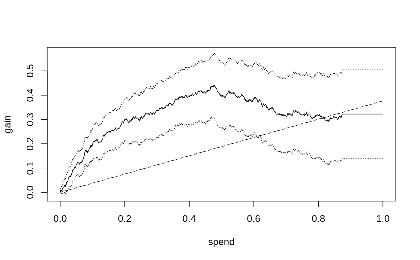
The solid curve shows the expected gain (y-axis) as we assign treatment to units predicted to benefit the most per unit spent, as we increase the amount we are willing to spend per unit (x-axis), along with 95 % confidence bars. The dashed line shows the Qini curve when we assign treatment without considering the CATE, i.e., at the end of this line, at which point we have exhausted the budget and given everyone the treatment, our gain is equal to the ATE of 0.38. (So, points on the dashed-line represent the fraction of the ATE we can expect when targeting an arbitrary group of the population at different spend levels, thus it does not have to be a 45-degree line)
The solid black curve is the Qini curve that uses the estimated CATEs to predict which test set subjects have the highest treatment effect per unit spent. As this curve rises sharply above the dashed straight line that “ignores” the CATE, it suggests there is a benefit to targeting treatment to a subpopulation as implied by the estimated CATEs, that is most responsive per unit spent. This curve stops (or “plateaus”) at \(B=\) 0.89 because at that point we have assigned treatment to the units predicted to benefit, \(\hat \tau(X_i) > 0\).
We can read off estimates on the curve at various \(B\) through
average_gain(qini, spend = 0.2)
#> estimate  std.err
#>    0.288    0.044
That is, at an average spend of \(B=0.2\) a 95% confidence interval for the average benefit per unit is 0.29 \(\pm\) 0.09. (these standard errors are conditional on the estimated function \(\hat \tau(\cdot)\) and quantify test set uncertainty in estimating the Qini curve).
Had we instead used the same amount of budget to treat an arbitrary group of the population, our estimated gain would be
average_gain(qini.baseline, spend = 0.2)
#> estimate  std.err
#>    0.075    0.019
Note on policy evaluation: Whenever IPW can solve a
problem, there is generally a doubly robust method (here Augmented-IPW)
that can do better in terms of statistical power. In this vignette,
we’ll stick to evaluating with IPW for simplicity, but note that with
GRF you could train a separate test set forest and retrieve doubly
robust test set scores through the function
get_scores(forest) that could be used in place of
IPW.scores, yielding a doubly robust estimate of the Qini
curve.
Aside: The Qini curve vs the TOC curve
We have thus far introduced two curves that may seem to both
serve a similar purpose. What’s the difference? That depends on the
application. If we look closer, which of these curves is useful depends
on what questions we are interested in. Below is a side-by-side
illustration of what the TOC
and Qini curves could look like in the case the ATE is positive, but
there are subgroups of people with both positive and negative treatment
effects (the dashed line in the Qini plot represent the ATE).
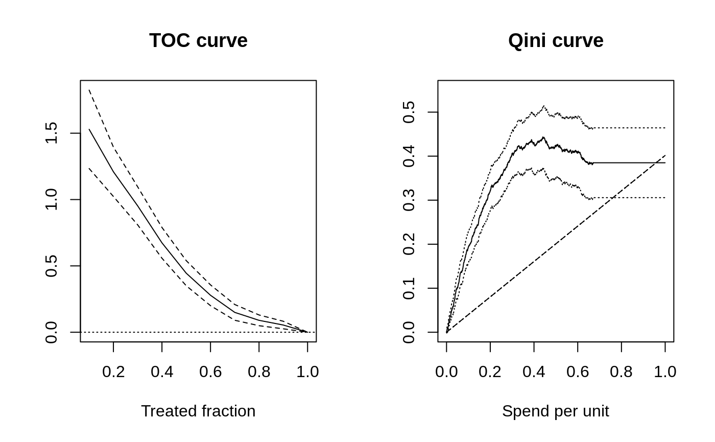
The TOC compares an average treatment effect over the quantiles of some scoring rule to the overall average treatment effect. The Qini curve quantifies an average treatment effect per unit as we vary a budget constraint on spend per unit.
So: The TOC curve is useful if you are in a setting where you are interested in whether there is a group of people that benefit more than average from being treated. If costs are not directly relevant, and you are more interested in detecting the presence of heterogeneity, then the TOC is helpful because it clearly reveals the quantile where targeting helps. The TOC thus serves as a general tool for measuring heterogeneity.
The Qini curve is useful if you are in a setting where it is natural to undertake some cost-benefit analysis. The Qini curve is helpful because it clearly reveals the expected gain you can achieve by targeting the most responsive units, per spend, at various levels of budget allocations available. Another benefit of the Qini curve is that it is also more natural to be extended to many treatment arms, as the cost element carries over a similar cost-benefit tradeoff, but now across both arms and units.
Note on constant costs: For a single treatment arm, when each unit has the same cost \(C_i(X_i) = 1\), we can also interpret the x-axis on the Qini curve plot above as the treated fraction.
Qini curves with multi-armed treatment
Consider now the case where we have \(k = 0,\ldots K\) arms available, where \(k=0\) is a zero cost control arm. For example, \(k=1\) could be a low-cost drug, and \(k=2\) could be a higher-cost drug, but which is more effective (and \(k=0\) could be a placebo control).
Given estimated treatment effects \(\hat \tau(\cdot)\), and costs \(C(\cdot)\) (remember that these objects are now vector-valued, i.e. the \(k\)-th element of \(\hat \tau(X_i)\) is an estimate of the CATE for arm \(k\) for units with covariates \(X_i\)1) - we now ask: how can we conduct a similar exercise as above where we evaluate allocating treatment optimally in accordance with our estimated CATEs (and costs), as we vary the available budget?
It turns out that in order to perform this exercise, we need to solve a constrained optimization problem, as the underlying policy object \(\pi_B(X_i)\) now has to optimally select among many potential arms (with different costs) for each unit. For example, at each spend level, we have to decide whether we should allocate some initial arm to Alice, or perhaps, if Bob was already assigned an arm, if we instead should upgrade Bob to a costlier, but more effective arm.
The maq package
performs this exercise efficiently (by computing a solution path via a
tailored algorithm), and we’ll here jump straight into a toy example
with 2 treatment arms and a control. We are simulating a simple example
where one treatment arm (number 2) is more effective on average but
costlier. We are imagining the cost of assigning any unit to the first
arm is 0.2 (on some chosen denomination), and the cost of assigning each
unit to the second arm is 0.5 (costs could also vary by units based on
some known characteristics, in which case we could supply a matrix as
the cost argument below).
# Simulate two treatment arms (1 and 2) and a control arm 0.
n <- 3000
p <- 5
X <- matrix(runif(n * p), n, p)
W <- as.factor(sample(c("0", "1", "2"), n, replace = TRUE))
Y <- X[, 1] + X[, 2] * (W == "1") + 1.5 * X[, 3] * (W == "2") + rnorm(n)

# 1) Train a CATE function on training set.
train <- sample(n/2)
c.forest <- multi_arm_causal_forest(X[train, ], Y[train], W[train])

# 2) Predict CATEs on test set.
test <- -train
tau.hat <- predict(c.forest, X[test, ], drop = TRUE)$predictions

# 3) Form a multi-armed Qini curve based on IPW (convenience function part of `maq`).
IPW.scores <- get_ipw_scores(Y[test], W[test])

# The cost of arm 1 and 2.
cost <- c(0.2, 0.5)

# A Qini curve for a multi-armed policy.
ma.qini <- maq(tau.hat, cost, IPW.scores, R = 200)

# A "baseline" Qini curve that ignores covariates.
ma.qini.baseline <- maq(tau.hat, cost, IPW.scores, target.with.covariates = FALSE, R = 200)
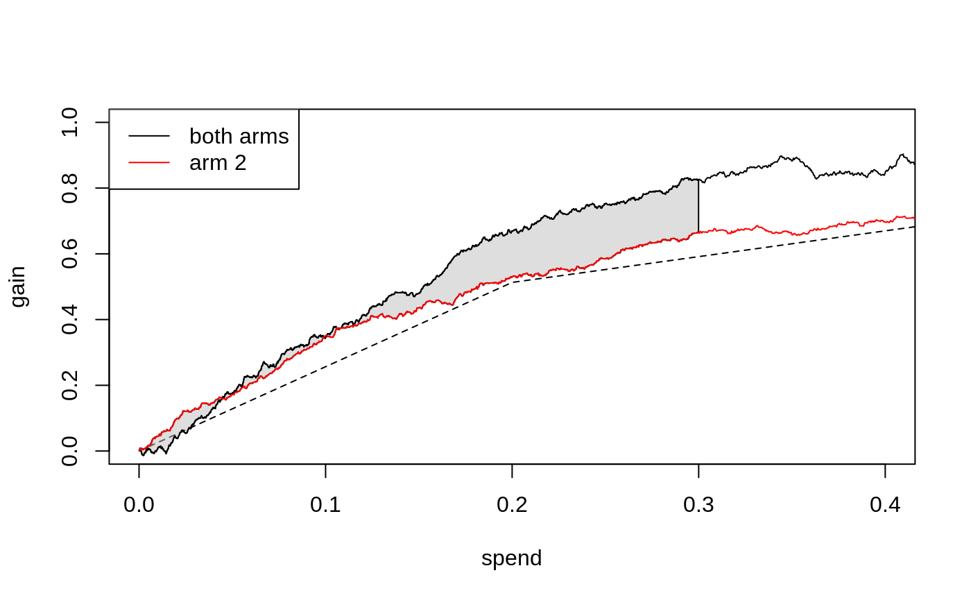
The Qini curves for a multi-armed policy looks like
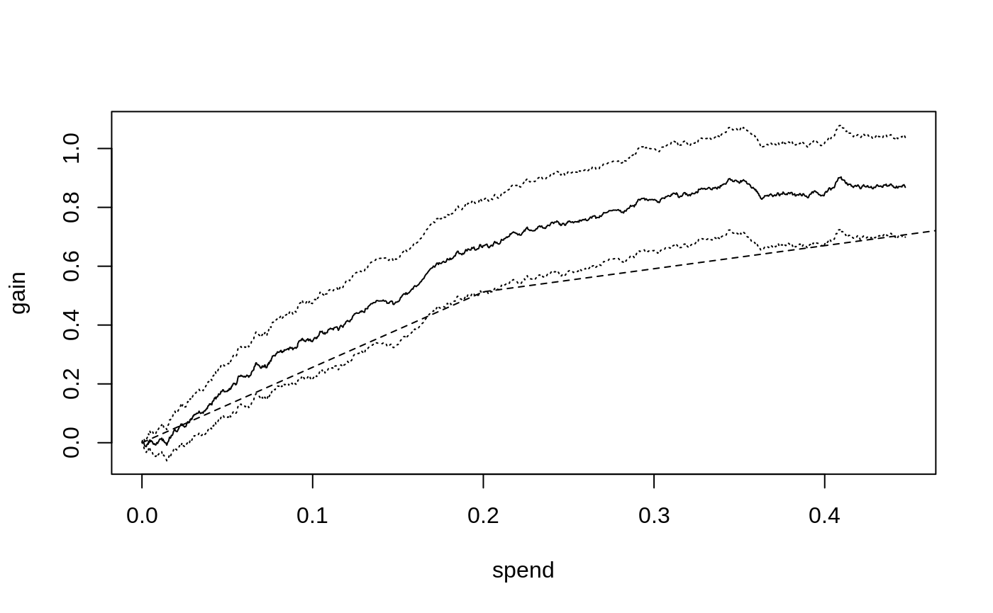
The dashed line represents a Qini curve that allocates treatment to
arms based only on the averages of tau.hat. This curve has
a kink at \(B=0.2\): the first segment
traces out the ATE of the lower cost arm, and the second segment the ATE
of the higher cost but on the average more effective arm. Points on this
curve represent the average benefit per unit when targeting an arbitrary
group of units2.
The solid line shows the estimated Qini curve for a policy that uses
tau.hat and cost to assign the treatment arm
to the unit that is predicted to be most cost-beneficial at a given
spend. We can assess the value of targeting with both arms over randomly
assigning treatment by estimating the difference between the dashed and
solid lines. For example, at \(B=0.3\),
this vertical distance is
difference_gain(ma.qini, ma.qini.baseline, spend = 0.3)
#> estimate  std.err
#>    0.235    0.049
We can retrieve an estimate of the underlying multi-armed policy
\(\pi_B\) through predict,
for example at \(B=0.3\)
pi.hat <- predict(ma.qini, spend = 0.3)
head(pi.hat)
#>      [,1] [,2]
#> [1,]    1    0
#> [2,]    1    0
#> [3,]    1    0
#> [4,]    1    0
#> [5,]    0    1
#> [6,]    0    0
\(\pi_B(X_i)\) is now a \(K\)-dimensional vector, i.e. the \(i\)-th row above has a 1 in the \(k\)-th column if we at that spend level assign arm \(k\) to that unit, with all entries zero if the control arm is assigned.3
We can also compare with single-armed treatment policies by computing Qini curves for each arm.
qini.arm1 <- maq(tau.hat[, 1], cost[1], IPW.scores[, 1], R = 200)
qini.arm2 <- maq(tau.hat[, 2], cost[2], IPW.scores[, 2], R = 200)

plot(ma.qini, ci.args = NULL) # leave out CIs for legibility.
plot(qini.arm1, add = TRUE, col = "blue", ci.args = NULL)
plot(qini.arm2, add = TRUE, col = "red", ci.args = NULL)
plot(ma.qini.baseline, add = TRUE, lty = 2, ci.args = NULL)
legend("topleft", c("both arms", "arm 1", "arm 2"),
       col = c("black", "blue", "red"), lty = 1)
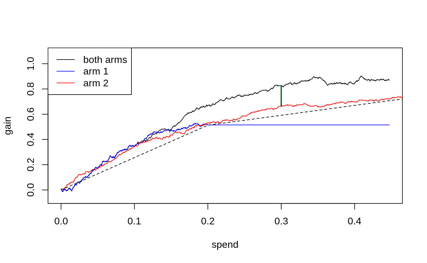
The blue line (arm 1) plateaus at a spend level of around 0.2, since once we have reached this spend level, we are already giving treatment to all units believed to benefit from arm 1 (i.e. \(\hat \tau_1(X_i) > 0\)), and so cannot achieve further gains via increased spending.
Qini curves for single-armed treatment rules can help assess the value of targeting with a specific arm or targeting function. The multi-armed Qini generalization allows us to answer questions such as “For a specific spend level, what is the estimated increase in gain when optimally targeting with both arms as opposed to using only a single arm?”. Let’s call \(\hat Q(B)\) the estimated Qini curve for the multi-armed policy and \(\hat Q_2(B)\) the estimated Qini curve for arm 2. At \(B = 0.3\), the difference \(\hat Q(B) - \hat Q_2(B)\) (illustrated by the green vertical line in the above plot) is
difference_gain(ma.qini, qini.arm2, spend = 0.3)
#> estimate  std.err
#>    0.154    0.073
In this example, a multi-armed policy achieves a larger gain than the arm 1 policy by assigning the treatment that is most cost-beneficial to each test set unit (points on arbitrary curves can be compared with this function, yielding paired standard errors that account for the correlation between Qini curves fit on the same test data).
We can also compare different targeting strategies across a range of
spend levels. The function integrated_difference estimates
an area between two Qini curves. An estimate of the shaded area below
(the integral \(\int_{0}^{0.3} \left(Q(B) -
Q_2(B)\right)dB\))
is given by
integrated_difference(ma.qini, qini.arm2, spend = 0.3)
#> estimate  std.err
#>   0.0087   0.0575
References
Sverdrup, Erik, Han Wu, Susan Athey, and Stefan Wager. Qini Curves for Multi-Armed Treatment Rules. Journal of Computational and Graphical Statistics, 2025. (arxiv)
Yadlowsky, Steve, Scott Fleming, Nigam Shah, Emma Brunskill, and Stefan Wager. Evaluating Treatment Prioritization Rules via Rank-Weighted Average Treatment Effects. Journal of the American Statistical Association, 120(549), 2025. (arxiv)
There are many approaches to estimating CATEs in the single-armed setting that can be adopted in the multi-armed case by simply fitting separate CATE functions for the different treatment arms. In this vignette, we use GRF’s
multi_arm_causal_forest, which jointly estimates treatment effects for the arms.↩︎With many treatment arms, this “baseline” arm allocation is going to trace out the upper left convex hull on the “average” cost and \(\hat \tau(X_i)\) plane.↩︎
Note that at most one unit will have a non-integer entry in this row matrix. If the particular budget is not enough to give the final \(i\)-th unit a treatment, then this unit will either have a single fractional entry, or two fractional entries, depending on whether the unit is being assigned an initial arm or upgraded to a costlier arm. These fractions can be interpreted as a probability of arm assignment.↩︎